Aanhou Wines
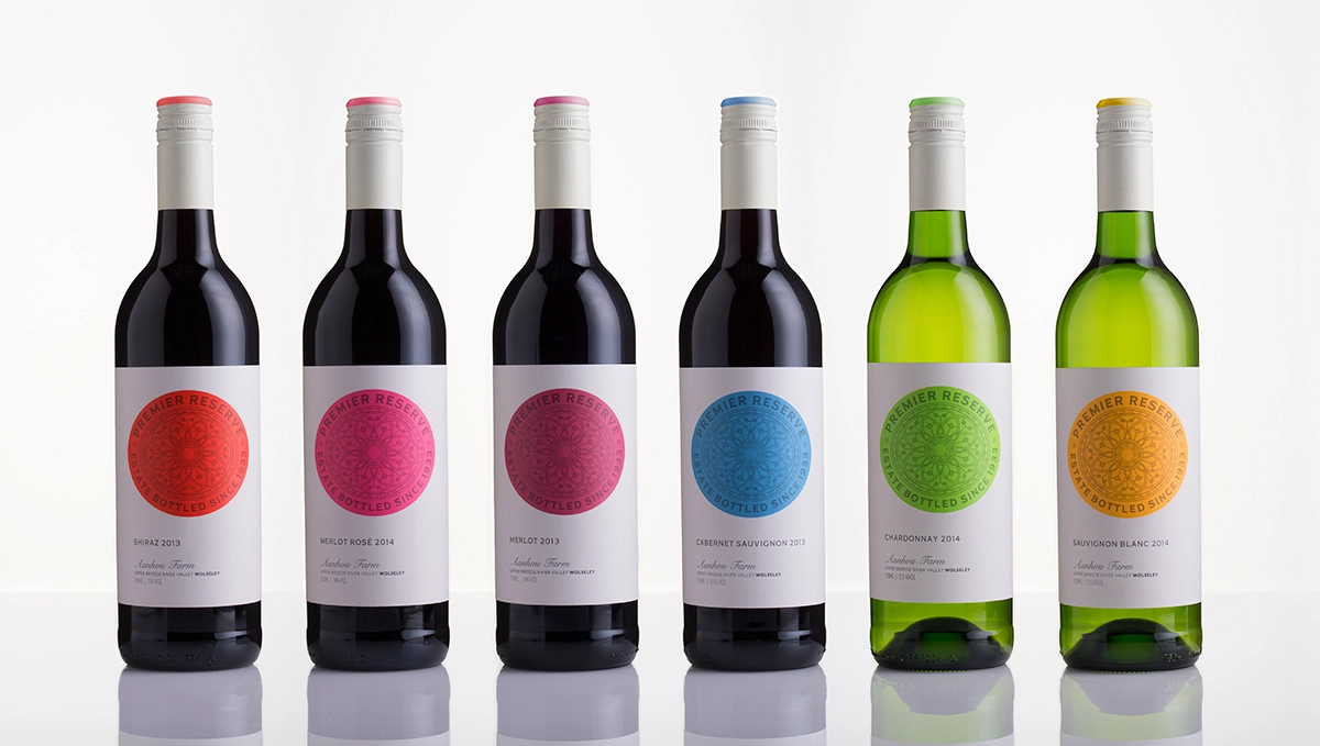
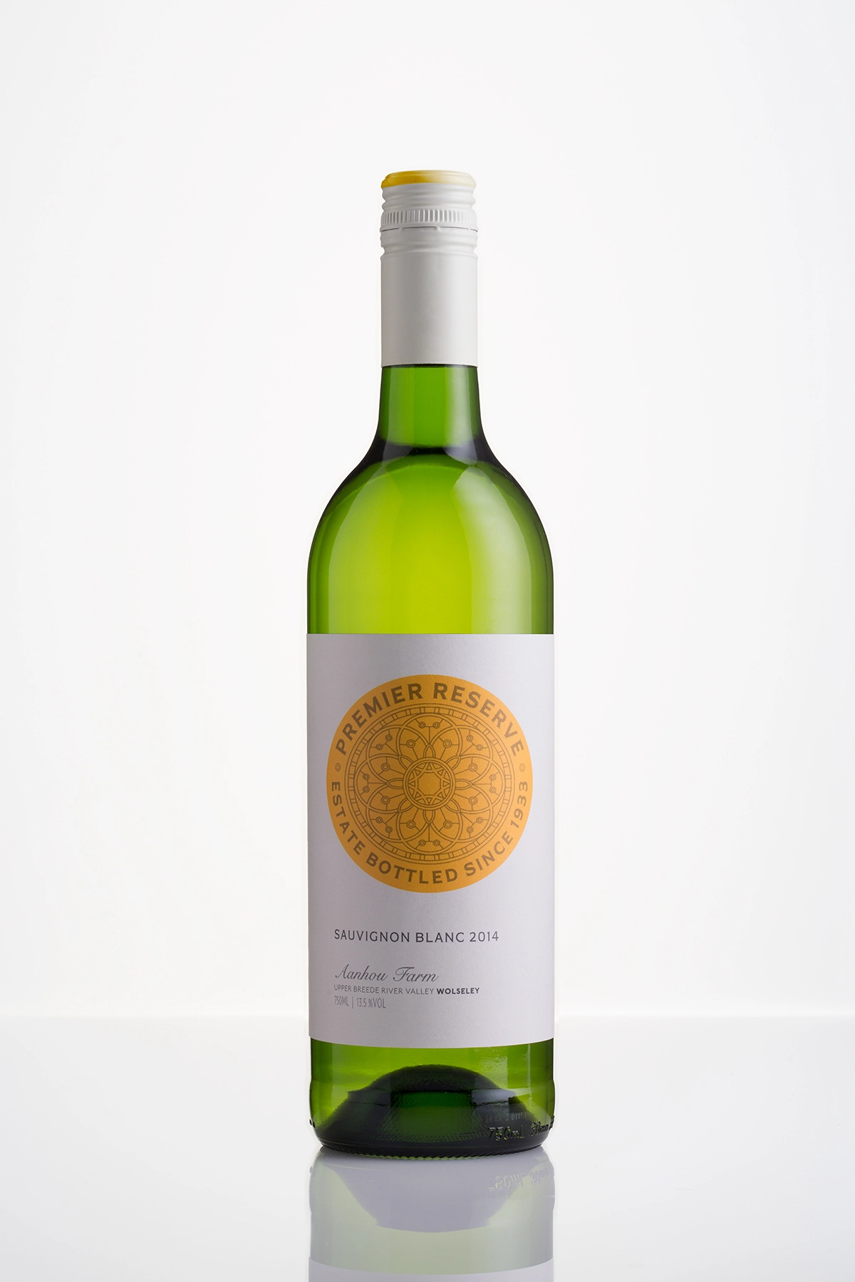
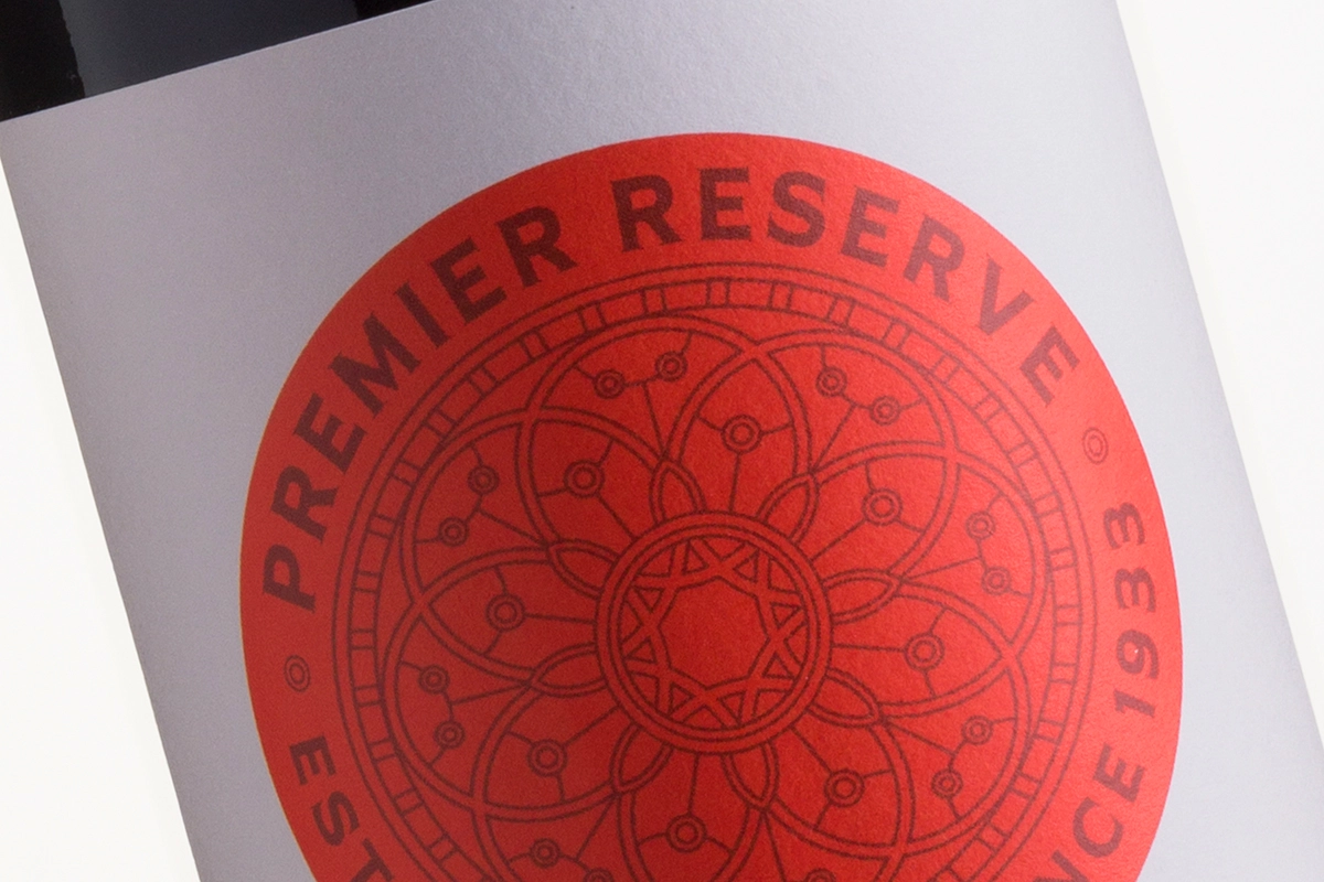
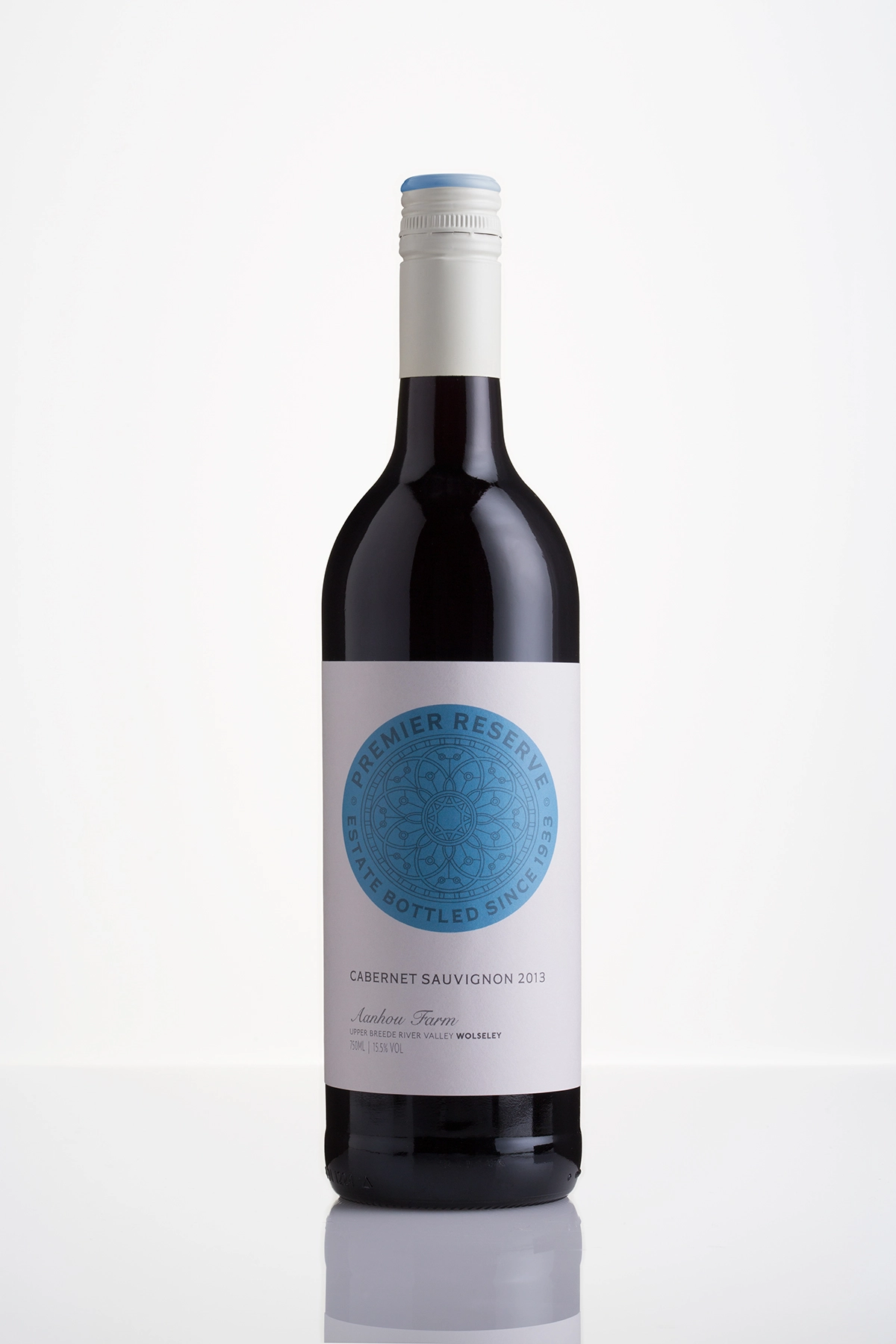
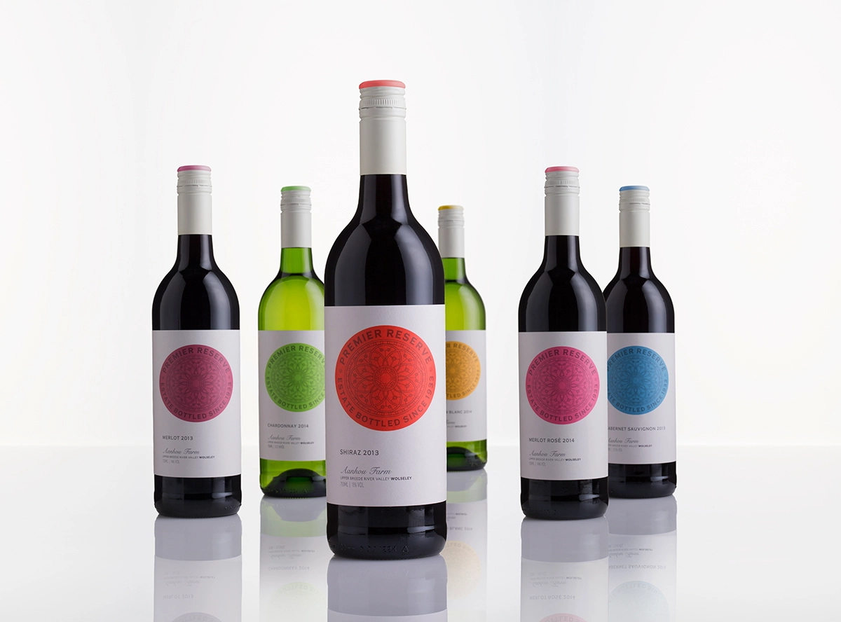
Translated from Afrikaans, ‘aanhou’ means continuity and perseverance. For this estate, the result is a very precise winemaking process. The detailed circular motif on these labels reflects that approach, and also catalogues the history of the farm. The use of bright colour means that the wines stand out on shelf, as well as allowing for clear delineation between cultivars. Inventively, the main icon is not a perfect circle: it has been deliberately bowed to appear that way on the rounded surface of a bottle.


