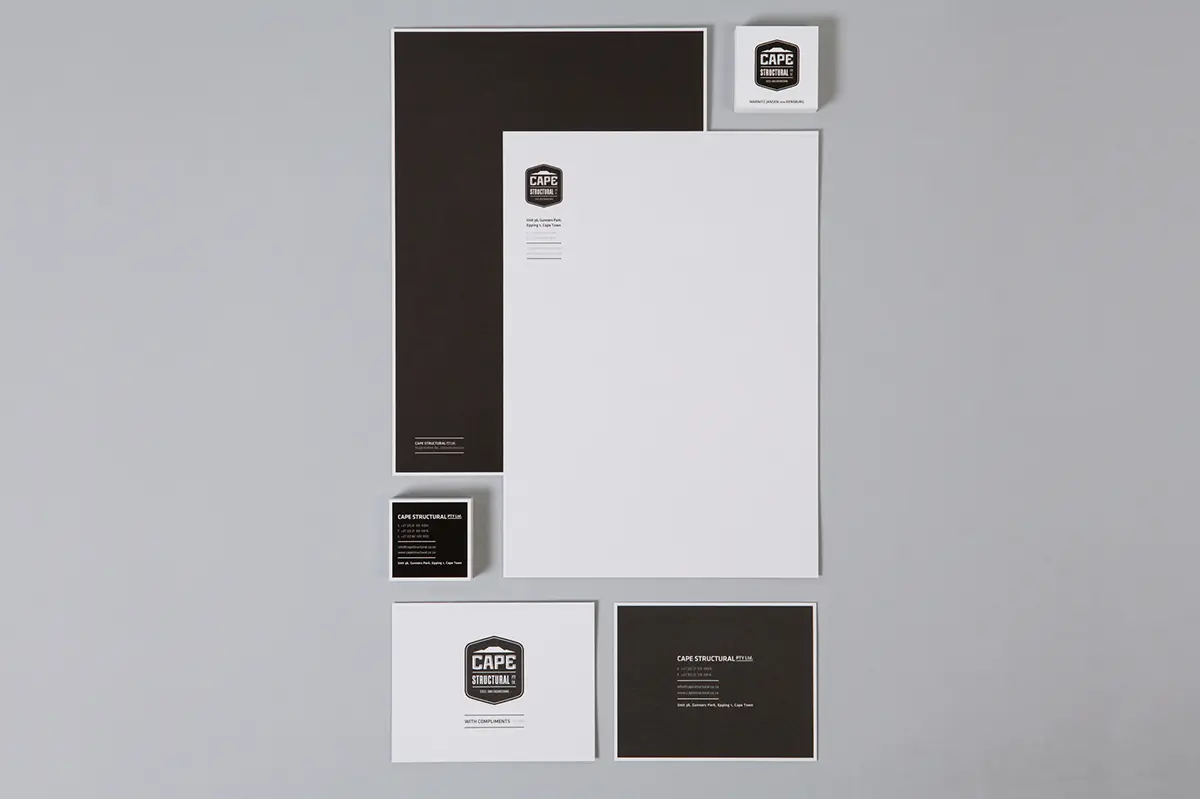
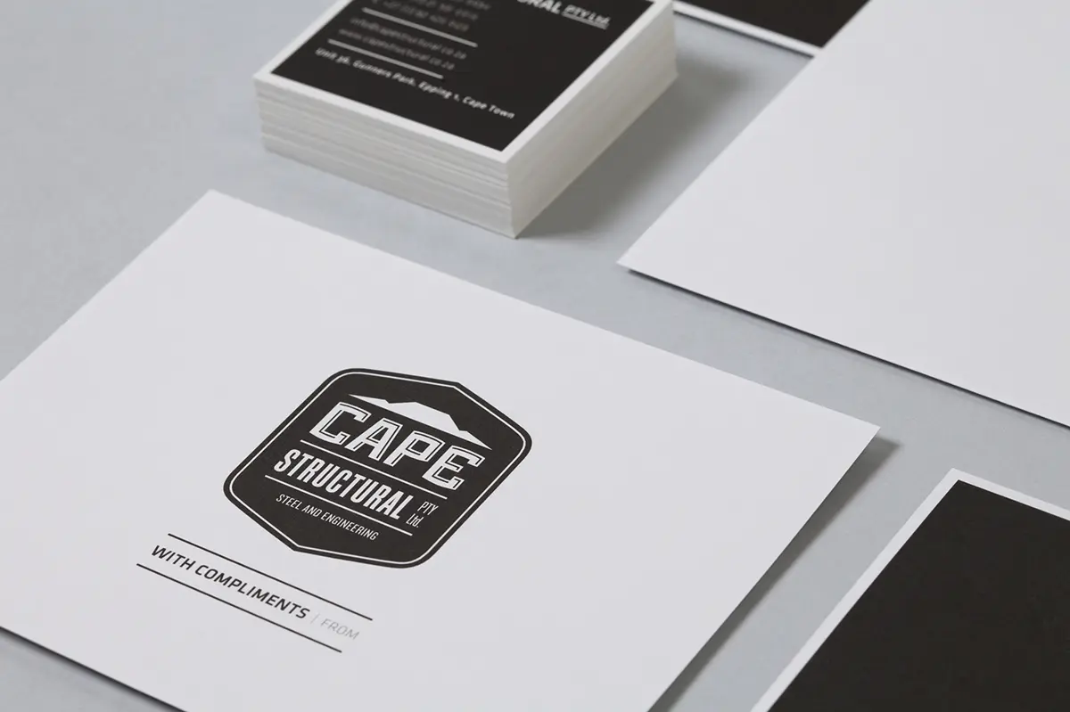
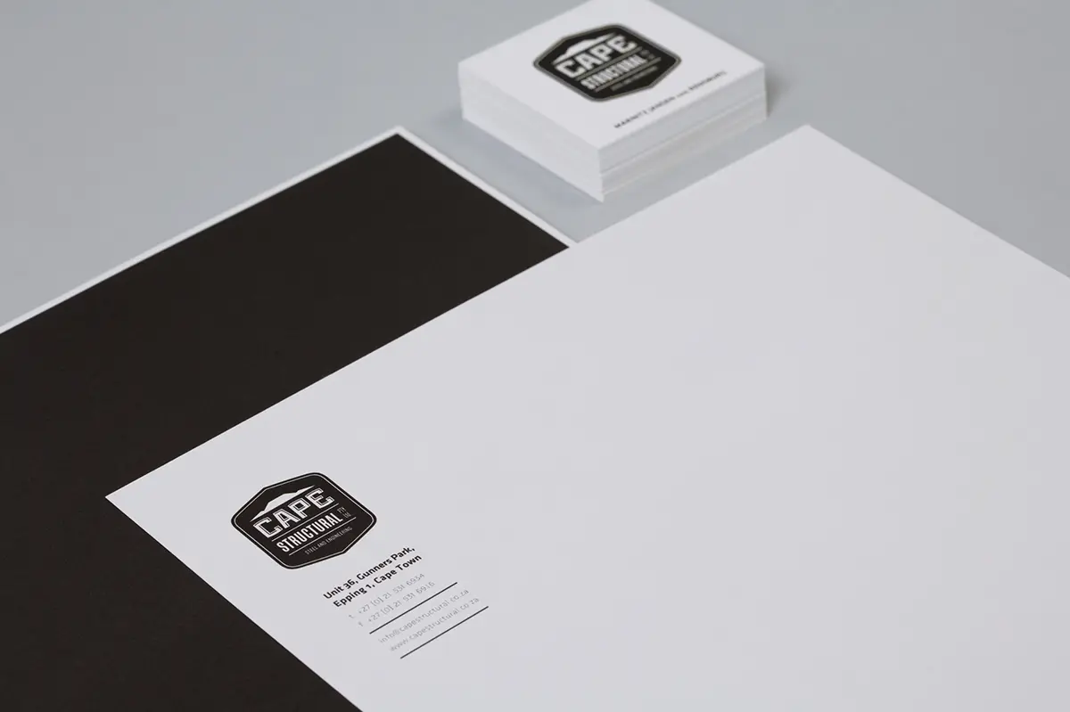
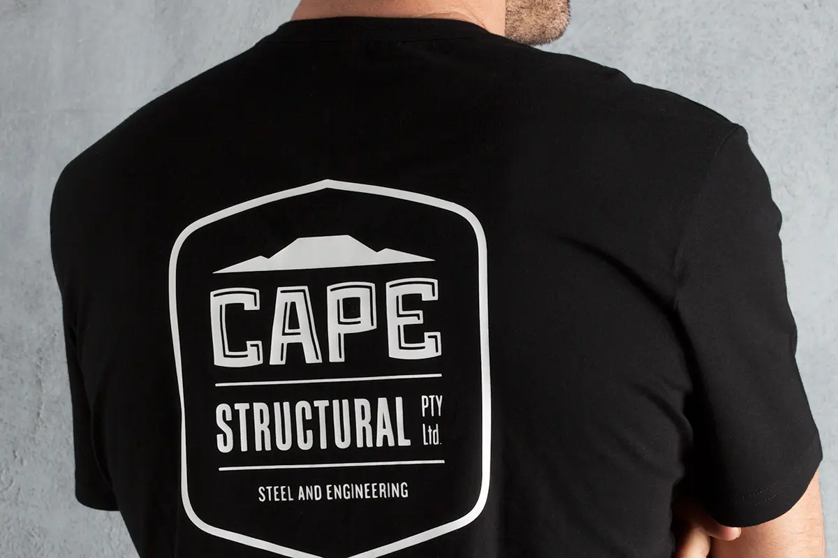
Cape Structural Steel and Engineering
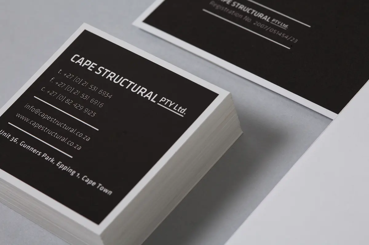
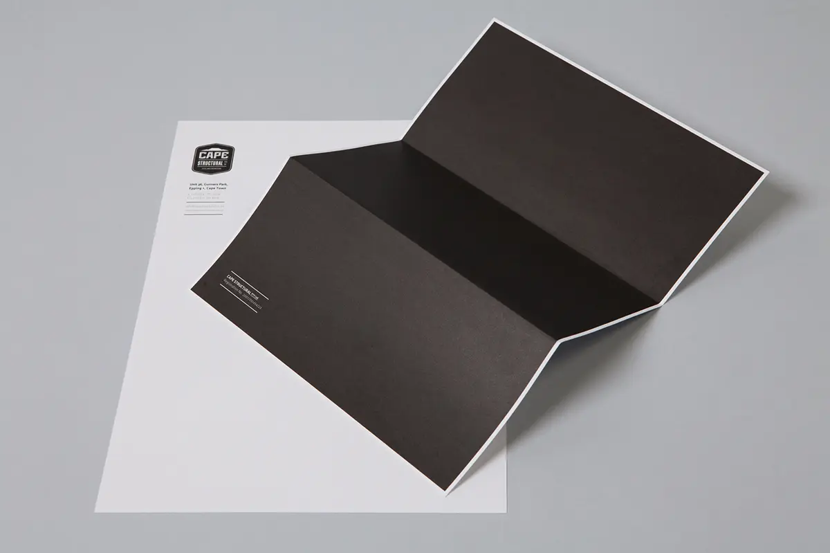
This newly formed steel company wanted a hardworking logo, literally and figuratively. Practically, black and white seemed the obvious choice – versatile and visible, given the construction environment. Typography is geometric and structured – a no-nonsenses approach that ‘does what is says on the tin’.


